Accessibility Reporting
Overview
This piece of work covers accessibility reporting for a large organisation and the tools I built to make it easier.
I've open sourced all the code for the accessibility report generator on GitHub.
Situation
Accessibility compliance was difficult measure and track across a large organisation. Trends were difficult to map which made it difficult to know which parts of the strategy were working and which were not.
Compliance was not measured consistently so when a service was marked as fully compliant, there was no indication on what level of testing had been done.
Most reporting in the organisation was based in complex Excel spreadsheets, which are difficult to make accessible.
Task
To create a set of measures and a way of reporting on compliance which made it consistent and trackable over time.
The report would need to be fully accessible but easy to maintain month on month.
Action
Defining a measure
The first thing I set about doing was to define what 'accessible' looked like.
Most people know by now, a digital product in the Public Sector needs to meet the Web Content Accessibility Guidelines 2.1 to the standard of AA and have a valid accessibility statement.
However, a lot of people miss the fact that this also includes making it work on assistive technologies. So I broke it down into 5 things teams needed to evidence that their service:
- meets all WCAG 2.1 A and AA criteria
- works using a screen reader
- works using a voice controller
- works using a screen magnifier
- has a valid accessibility statement
We provided testing templates for what we expected to be tested and then assessed the evidence when it came back in.
Creating the algorithm
The algorithm for working out how close a service was to meeting the standard is fairly rudimentary, but it gives a simple way to track progress. There are 5 pieces of evidence, and each one can contribute a maximum of 20% to the overall score to make up the 100% needed for compliance. For example:
- 0% is added when no evidence has been provided
- 10% is added when evidence is been provided but the testing raised issues which now need fixing
- 20% is added when evidence is provided and the testing did not raise any new issues
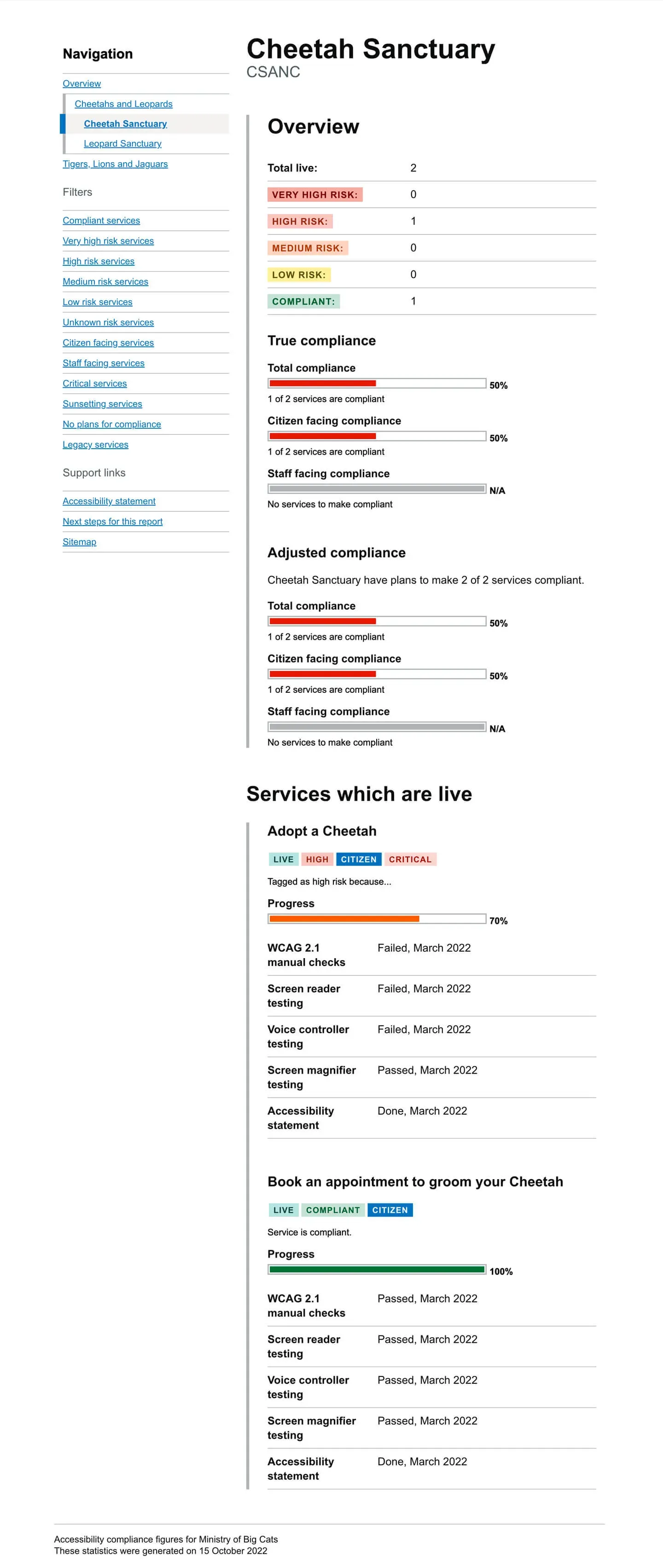
In the following screen shot, it shows an example service for a fictional organisation called the Ministry of Big Cats. It shows their 'Adopt a Cheetah' digital service is non-compliant. It also shows that it is currently live, categorised as high risk, is citizen facing and is a critical service to the organisation.
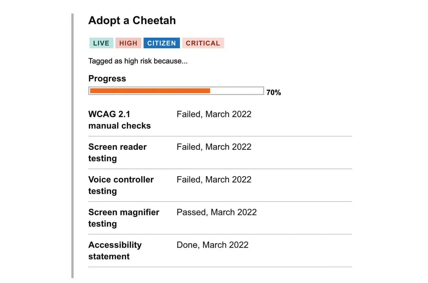
It has it's progress marked as 70% because it has failures against several pieces of evidence. So the maths would be as follows:
- +10% - WCAG 2.1 tests failed
- +10% - Screen reader tests failed
- +10% - Voice controller tests failed
- +20% - Screen magnifier tests passed
- +20% - The accessibility statement is valid
Creating a structure of accountability
In order for this to be successful, there needed to be a way that accountability was spread across all levels of the organisation. If the consequences of the inaccessibility of a service is confined to the team that built it, then they are likely to continue in their silo unchallenged.
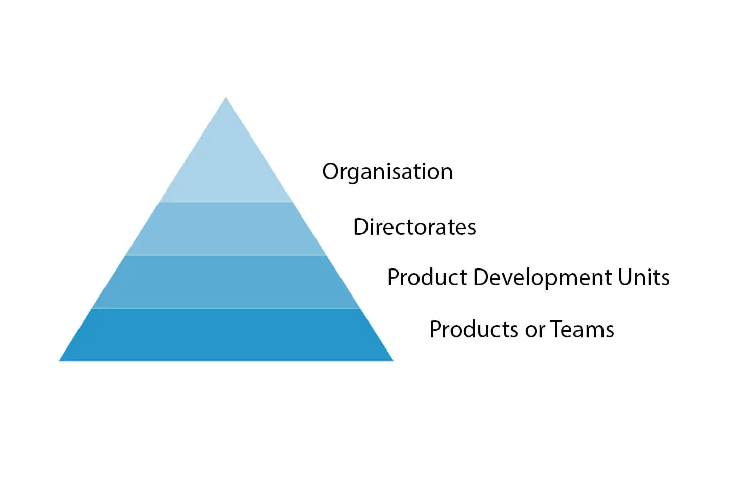
The idea was to create accountability which bubbles up through the various levels of the organisation right to the top.
So, I gathered all of the services up and simply calculated the mean average for each area. This might be known as a functional area, a product development unit or a portfolio of services.
Now each team contributes to the accessibility of an area, there is a accountability at the level which overseas all of those services to make sure they're all compliant.
I repeated this for each level of the organisation and reported the organisation as a whole right at the top of the pyramid.
Building the reporting tool
The report needed to be accessible. So the obvious format was HTML.
Rather than manually updating the data, I built a tool using NodeJS which would ingest data objects for each service and produce an output report.
The data is held in a collection of JavaScript files. I originally opted for JSON, but sometimes I needed to comment the data out to remove it from the report, and JSON did not allow this.
Each piece of data is assigned to a constructor. It can be one of the following:
- Org, which stands for Organisation
- Directorate
- PDU, which stands for Product Development Unit
- Service, which is an individual product
An example of the data which forms a Service:
module.exports = {
name: 'Adopt a Cheetah',
status: 'live',
alias: '',
type: 'citizen',
risk: 'high',
critical: 'true',
sunsetting: 'false',
plans: 'true',
legacy: 'false',
evidence: {
wcag: {
status: 'failed',
date: 'March 2022'
},
screen_reader: {
status: 'failed',
date: 'March 2022'
},
voice_controller: {
status: 'failed',
date: 'March 2022'
},
screen_magnifier: {
status: 'passed',
date: 'March 2022'
},
statement: {
status: 'done',
date: 'March 2022'
}
},
notes: 'Tagged as high risk because...'
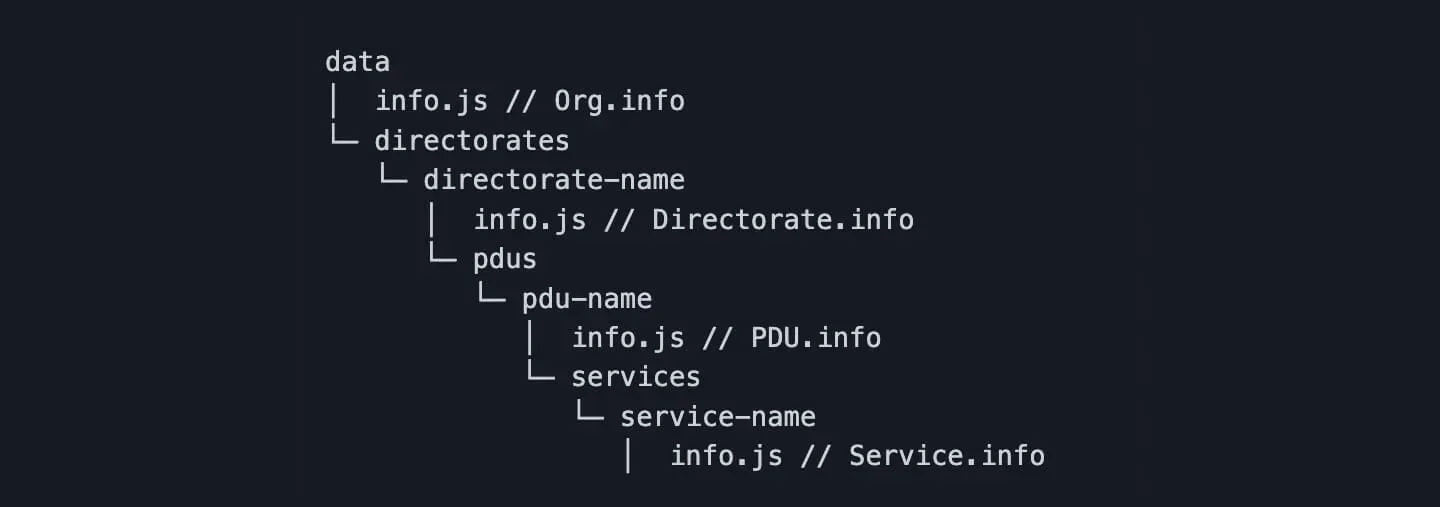
}The data is structured by simply using directories or folders with a small number of config files. If you put the config files in the correct place the application will build relationship data model for you.
An example of the relationship data model:
- Organisation
- Has many Directorates
- Has many PDUs
- Has many Services
- Directorate
- Belongs to an Organisation
- Has many PDUs
- Has many Services
- PDU
- Belongs to an Organisation
- Belongs to a Directorate
- Has many Services
- Service
- Belongs to an Organisation
- Belongs to a Directorate
- Belongs to a PDU
An example of the folder structure:
- In the data folder you have a config file which represents the organisation and a folder named directorates.
- In the directorates folder, you have a folder for each directorate, and again you have a config file inside each one to represent it. A product development unit folder in each directorate folder holds the PDUs attached to that directorate.
- Each PDU folder has a config file and a folder called services to hold it's services.
- Each service folder contains a config file which represents the data and evidence for that service.
Building it as a relationship data model allows you to assign methods which make sorting through the data much easier.
For example:
Org.getDirectorates()
Org.getPDUs()
Org.getServices()
Directorate.getOrg()
Directorate.getPDUs()
Directorate.getServices()
PDU.getOrg()
PDU.getDirectorate()
PDU.getServices()
Service.getOrg()
Service.getDirectorate()
Service.getPDU()
If you put all the data in the right place and run npm run build you get a fully accessible report on the compliance of your organisation.
Result
Having a shiny visual report was a lot more interesting and inspiring for teams than a huge complicated excel spreadsheet.
Being able to have accountability over multiple levels of the organisation helped to get people bought in. The psychology of having everything visible helped in a few different ways:
- Teams could see how they compared to other teams across their area and organisation and how their contributions (or lack of) directly impacted the areas they worked in.
- Deputy Directors could see a snapshot of their entire area and compare it to others. They could then put pressure on teams who were dragging down the statistics for everyone else.
- Directors could do the same, but for all of the PDUs in their directorate.
- Finally, it gave a full overview of the organisation as a whole. So the people right at the top can see where the problem areas are.
Since the introduction of the report, compliance across the organisation has increased steadily over time and rarely gone backwards.