Blog posts tagged with the following topic: "design"
The hidden function of the 'check your answers' pattern'
Excerpt:
A friend of mine, stated that usually when we add steps to a process, people get concerned that it will add friction and lead to fewer conversions. But, he argued that it is even more costly to the business to deal with mistakes, and therefore we should use the check your answers pattern.
I agree. There is always a user need to make sure the information they have entered is correct, and a check your answers page is the easiest way to do that. That is it's primary function.
But, what I want to cover in a bit more depth, is the secondary function which often gets overlooked: The pause!
These two criteria are important, because they help screen readers to read out the language correctly. If your page is set to English, but some of your content is not English, then the screen reader is just going to attempt to pronounce it in English anyway, which can lead to some pretty weird results.
As an interaction designer, I hear a sentence at least once on every project I work on. "We can't do that because [insert mediocre excuse here]."
A lot of the time this is because of technology restrictions. We can't integrate with legacy systems. Or, we can, but the legacy system wants the information in a ridiculous format. So we have to change the design to ask for a mandatory middle name, where people have to write "none" in the box to progress. Urgh.
It's easy to make a snap decision, bow to peer pressure and change the design. After all, we don't want to waste our time designing something that's not possible.
Ok, this maybe should have been called one-page-applications are rarely accessible. Anything can be made accessible, it just takes a lot of effort, and very few people put the effort in.
One-page-applications are on the rise. With them you get funky animations and cool transition effects. Some are a real beauty to behold.
The biggest problem with one-page-applications, is they often create a terrible experience for people using screen readers.
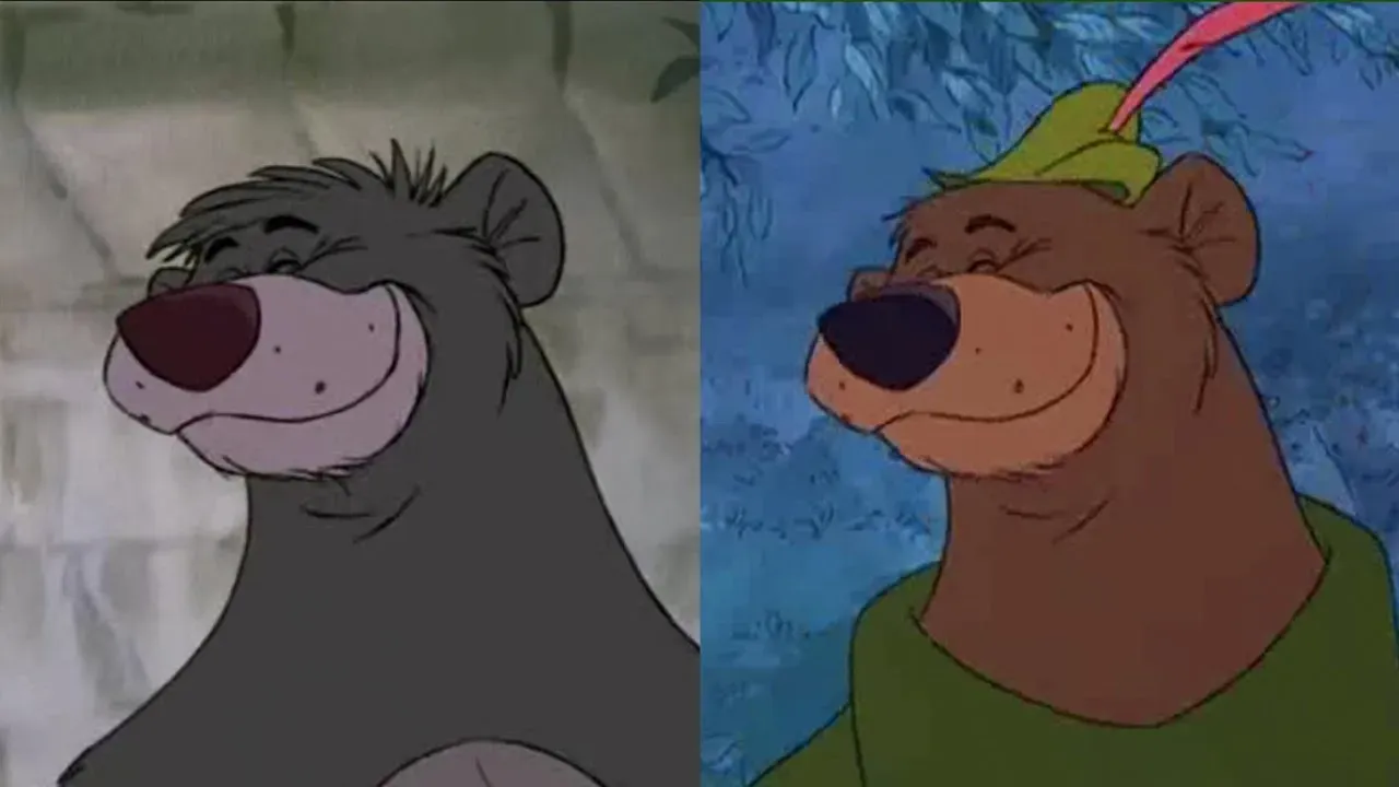
The idea of design-reuse has been around for many years. Walt Disney reused many scenes. They also reused entire characters. Cartoon creators called this reanimation. It's the process of tracing over existing frames to save time and money.
You may not have noticed before, but Disney's Baloo and Little John are almost identical. They were even voiced by the same person, Phil Harris.
I made a jQuery plugin a couple of years back. It picked up a data attribute called data-required. It also picked up an error message you passed into data-error. Then, it checked if the input was blank or unchecked. If it was, it would append the error messages and prevent the user from submitting the form.
The thing is, I thought I built the plugin off the back of a user need, and I was happy when people praised my work. But in reality, I think I missed the point. As did everybody that used it.
In Government our digital services get assessed at each stage of their journey. From Discovery into Alpha. Alpha through Beta. And Beta into Live.
Every service that ends up on GOVUK will have to go through this. Each one assessed against the service standard for Government.
A panel of trained assessors will conduct the assessment. Each panel member from a different discipline within digital. The panel will cover the team setup. Their design and research, and their chosen technology stack.
From my time as an assessor, I've noticed teams don't always conduct Alphas correctly.
As designers, we always like to put our stamp on things. We like to make things fancy and show off our full range of talents. Then when it comes to coding them up, we abuse our design!
We float things right. We use absolute positioning. We style links to look like buttons. We use fancy hover states and chuck in break tags in to create whitespace.
Then, we marvel at how pretty our designs look. After all, as long as it looks good, that's all that matters. Right?
On my iPhone, I don't have automatic updates turned on. I'm that guy that likes to read the release notes. Or, at least, I was.
Release notes used to be interesting. They'd tell you what the developers had been up to. What features they were adding, or removing. But, the most important thing they brought was the ability to make an informed decision. They gave you the chance to decide whether you actually wanted to install it or not.
Companies such as Slack and Monzo have fun with their release notes. They're proud to show you the new features they've been working hard on. But these two companies are becoming part of a minority. A small group of companies that actually bother to write anything.
Design and art go hand in hand. But they're not the same thing.
When I was younger, I identified as a graphic designer. I'd design logos and flyers for nightclubs in Newcastle. When you're doing this kind of thing, the lines between art and design blur a lot. And, I have to be honest, I didn't know the difference.
I'd combine art with principles such as the golden ratio, irradiation phenomenon and overshoot.
I'd pick typefaces to best represent the brand of the company I was designing for. There was some science to it, but it was still open to opinion. Somebody could still decide they didn't like my work. And clients often did.