Creating the DWP Accessibility Manual
The strategy research found there was no single source of truth for accessibility guidance. So I designed, built and published one.
The accessibility strategy research I did found that people lacked concrete guidance and a single source of truth.
Any existing accessibility guidance was fragmented across GOV.UK, the DWP intranet, and teams’ SharePoint sites. Much of it was outdated, incorrect, and didn’t really tell you in any detail what you needed to do, depending on your job role.
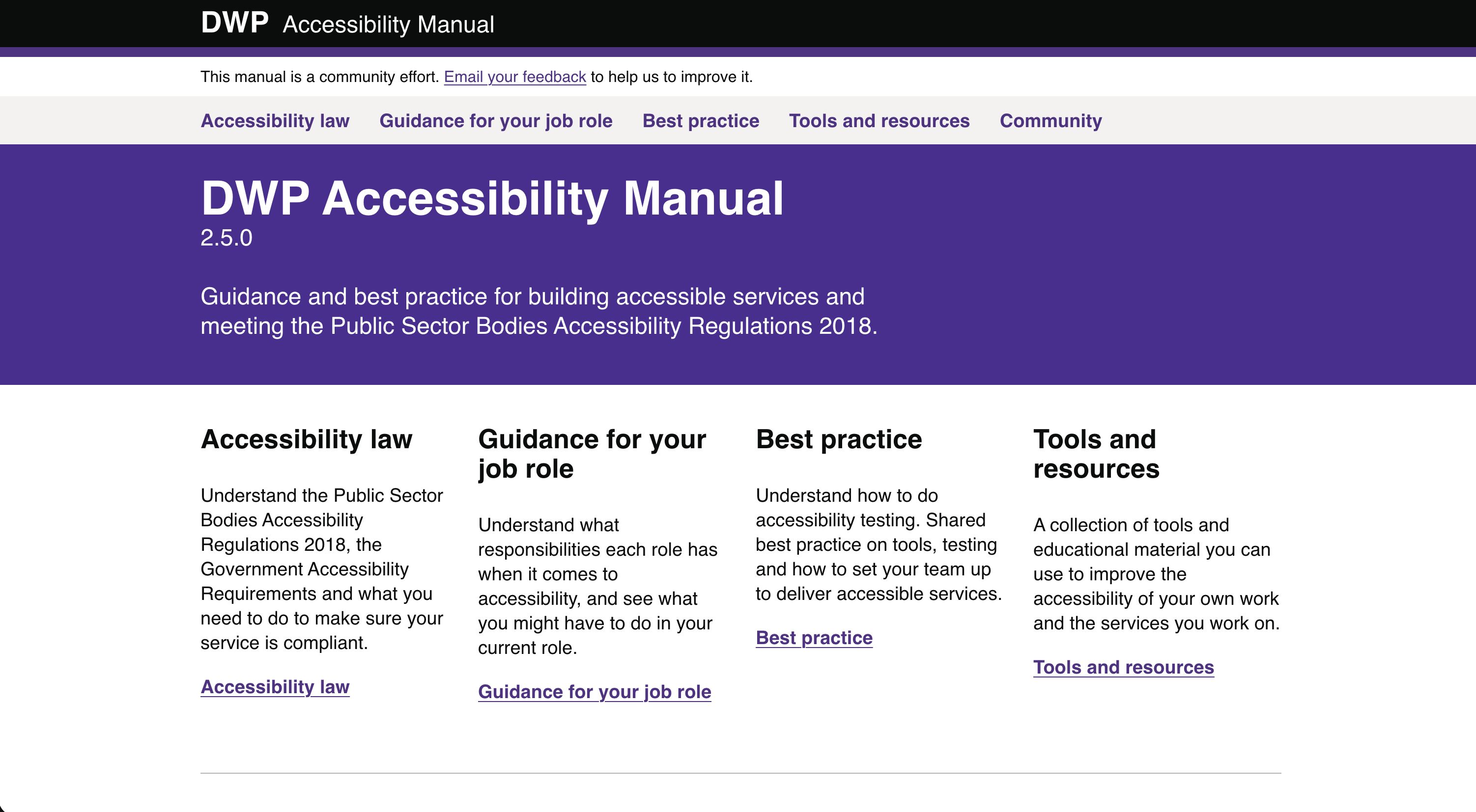
This case study is on the DWP Accessibility Manual. I created and published the first edition using a fork of the GOV.UK Design System, and made it open source from day one so that the community could own it. It’s a piece of work I’m really proud of, and which served the community well.
Situation
The research we did with teams across DWP highlighted that people were confused by the accessibility regulations, and how accessibility was relevant to their specific job role. It was clear there was a widespread misconception throughout the department that accessibility was “just the developer’s job”.
We gathered insights from interaction designers, content designers, user researchers, business analysts, product managers, developers and more, and ended up with a 26-page report. It clearly showed that very few roles knew exactly what they were supposed to be doing for accessibility:
- 37% of people lacked guidance, information and training
- 53% of people lacked access to software and tools
- 10% of people struggled to recruit users
To make matters worse, what little guidance did exist was difficult to find, and either too complicated or overly simplified. Finding out what you personally needed to do was like a puzzle you needed to piece together yourself, from dozens of different places.
Task
Create a central place that holds documentation and guidance on accessibility laws, responsibilities, testing tools and procedures.
In building it, it was also important that I followed the GOV.UK Design Principles. For example, it needed to meet user needs, be simple to use and understand, be iterative, be open, and be for everyone.
Action
Building the manual
I built the manual using a fork of the GOV.UK Design System, but changed the configuration behind the scenes to make it feel more like the GOV.UK Prototype Kit. This meant I could utilise all the hard work already done across government, and quickly build out an app structured for documentation, with Markdown as the primary format. Pages and guidance were easy to update, and easy for anyone to contribute to.
I contributed countless hours, and pushed over 60,000 lines of code, but I wanted the manual to be owned by the community, so I made it completely open source. Anyone could contribute to it, or reuse the codebase for their own projects.
Since I left DWP, the live manual has been maintained, but the public codebase on GitHub has not. Development work on the manual was moved into a private repo. However, the original codebase is still publicly available, and is still useful.
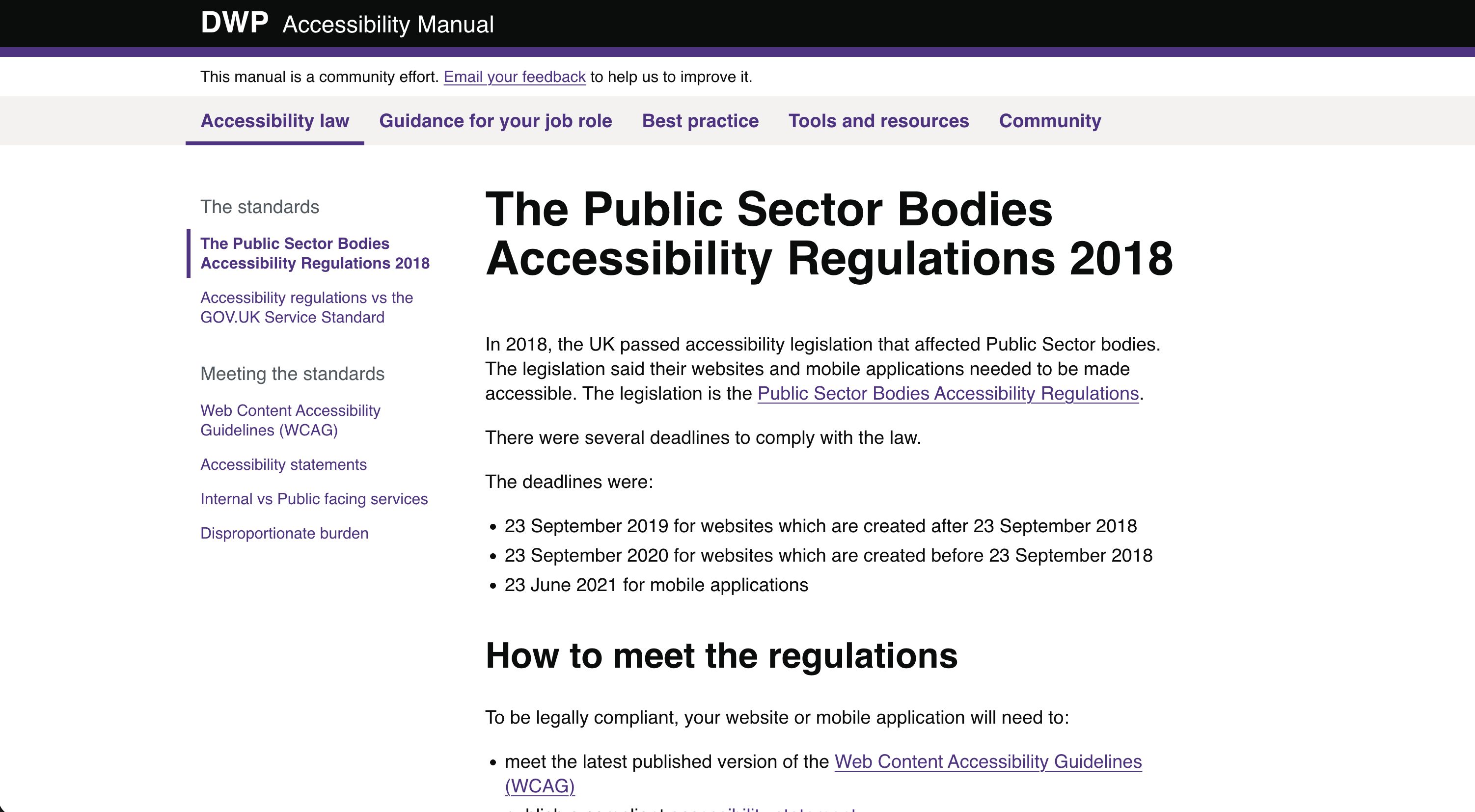
Guidance on the law
I wrote guidance explaining accessibility law and the legal landscape in plain English. For example:
- What are the Public Sector Bodies Accessibility Regulations 2018?
- How does compliance work?
- What are the standards, and what are the Web Content Accessibility Guidelines (WCAG)?
- What is an accessibility statement, and how do you write one?
The legislation is notoriously inaccessible reading, as it’s obviously written by lawyers. The manual’s job was to explain what people needed to do, rather than duplicate the content in the legislation itself.
This was to help answer the findings in the research that people didn’t know what compliance was, or what the requirements were.
Guidance for your job role
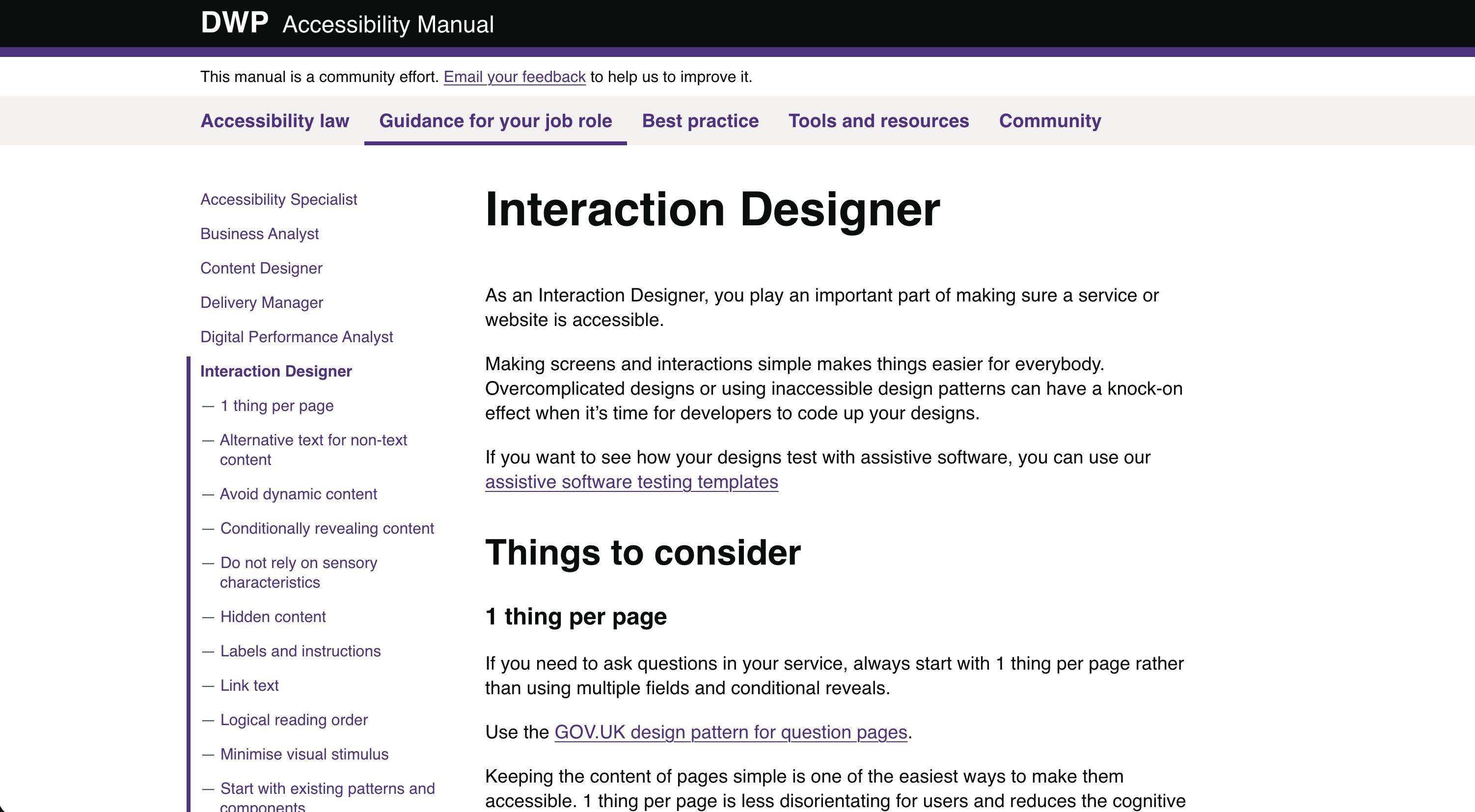
The most celebrated feature of the manual was the guidance for your job role. This included examples of accessibility responsibilities for the different roles in a team.
Whether you were a designer, developer, business analyst, content designer, user researcher, product manager, or QA tester, there was a section of guidance specifically covering the types of things you needed to do, and common mistakes. This was almost four years before the W3C published their first draft of Accessibility Roles and Responsibilities Mapping (ARRM), so it was groundbreaking at the time.
It was so well received because the research showed people didn’t understand their own responsibilities, and a lot of accessibility guidance is dev-heavy. For example, a business analyst doesn’t need to know about WAI-ARIA, they need to know how to write user stories for accessibility, and that it belongs in the definition of ready and done.
I also published specific examples of the common mistakes I often saw. The guidance for an interaction designer, for example, covered accessibility issues with dynamic content, conditional reveals, sensory characteristics, hidden content, links versus buttons, and colour contrast.
This was to help answer the findings in the research that people didn’t understand their responsibilities for accessibility.
Guidance on testing
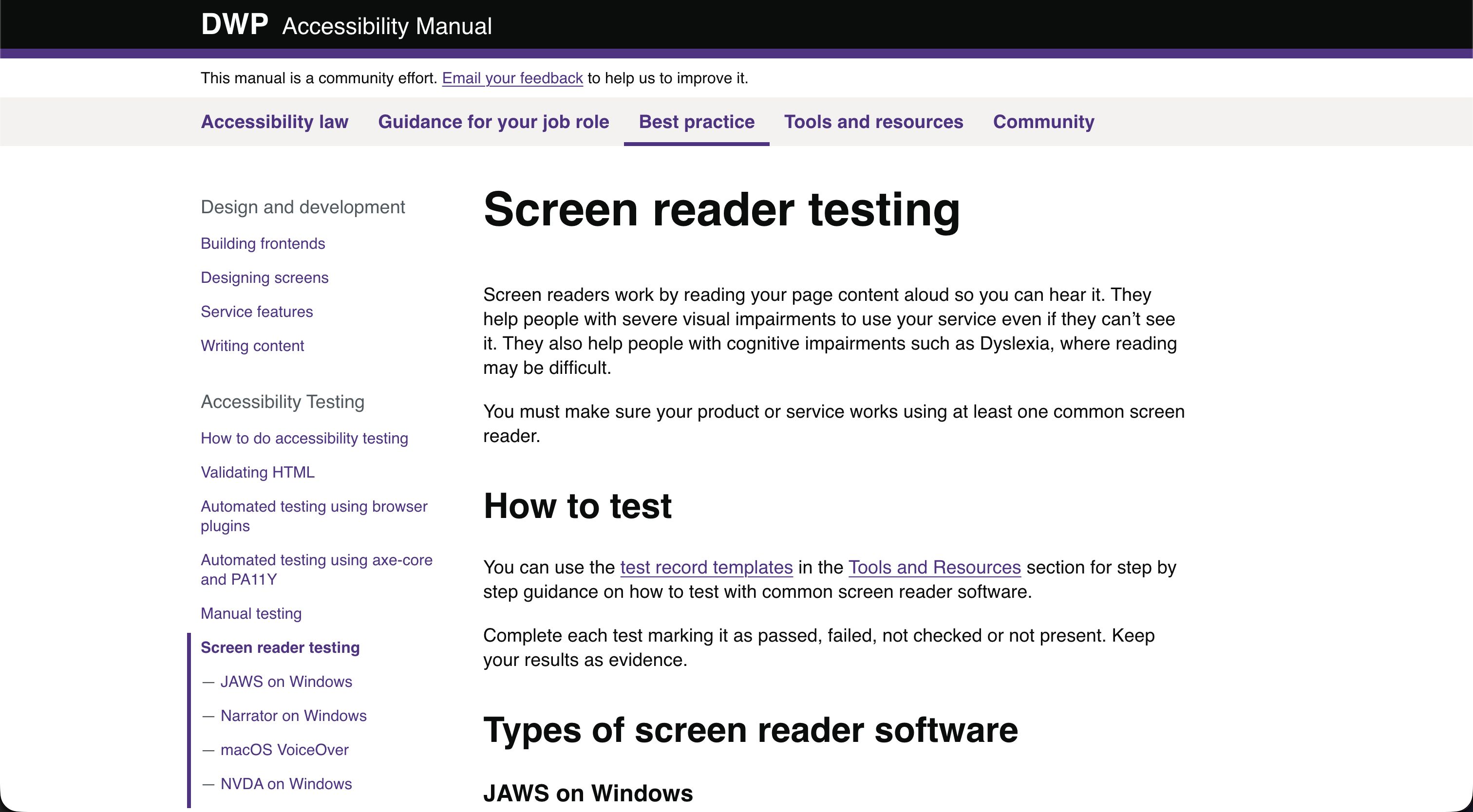
I also published a best practice section, which gave the technical members of the team guidance on building and testing front ends, and on the most efficient way to build accessibility into their product life cycle.
This focused heavily on how to actually do accessibility testing. It covered automated testing, HTML validation, manual WCAG checks, and how to use assistive technology properly, such as screen readers, screen magnifiers and voice control. For example:
- How to do accessibility testing
- Validating your HTML
- Automated testing using browser plugins
- Automated testing using axe-core and Pa11y
- Screen reader testing
- Screen magnifier testing
- Voice controller testing
This was to help answer the findings in the research that people didn’t know how to do accessibility.
Templates and test procedures
Accessibility testing was either not done or inconsistent. So, I created downloadable templates and test procedures teams could use. This included step-by-step guidance and templates on the different WCAG criteria, and different assistive technologies. This gave teams the confidence to carry out repeatable tests, and physical evidence they could log towards their compliance efforts.
As many services were so old, and so far from compliance, I also created basic accessibility checks which gave teams a list of 10 common problems, and how these impacted users. To decide what made the list, I pulled together the most common issues we found when testing services, and cross-referenced them with the figures released by the Central Digital and Data Office (CDDO). This would not ensure that teams were compliant, but it would allow them to remove a lot of the barriers much faster, and get much closer to compliance before carrying out a full assessment, which is far more time-consuming.
A lot of the problems with the culture around accessibility come from people seeing it as a technical problem, rather than a user-centred one. So, to illustrate how these problems cause issues for real people, and to make accessibility feel more human-centred, I also wrote personas to sit alongside these checks. I anonymised the personas, but they’re based on real people I’ve observed in user research sessions. For example, Charlie has retinitis pigmentosa, and despite working on a desktop computer, relies on websites reflowing into a portrait mobile layout.
This was to help answer the findings in the research that people didn’t know how to test for accessibility, document findings, or be confident in what passed or failed.
Accessibility principles
Finally, I also teamed up with Colin Oakley, and we created a set of five accessibility principles:
- Inclusion is better than empathy
- Accessible design is good design
- Start with what works
- If it’s not accessible, it’s not done
- This is still for everyone
I referenced these a lot in my day-to-day work, when talking to teams and in presentations. I would also reference them in official strategy documents and governance procedures, so that they were familiar to everybody. Guiding principles, in my opinion, are one of the best tools for culture change in large organisations. If everybody is bought into the principles, accessibility just becomes part of BAU (business as usual), and people will continue to do it, even when nobody is watching.
Result
The manual became exactly the single source of truth I wanted it to be, and one of the main things in the research findings which was missing. It’s still a solid resource on accessibility today, and is used regularly across government and the private sector.
I also collaborated with GDS to make sure all the guidance is aligned, and they now feature it in:
You can read more about it in the following articles:
At a glance
- Type
- Case study
- Organisation
- Department for Work and Pensions
- Role
- Head of Accessibility
- Date
- 2021–2023
- Built with
- Tags