User Journey Maps
Overview
User Journey Maps are similar to a Service Blueprint, but they are simpler and are usually limited to one actor.
Unlike a Service Blueprint, they won't show you a full end-to-end service. Instead, they focus on the qualitative insights gleaned from User Research with particular cohorts of people.
They feature actions, pain points, mood and quotes. All that good stuff you need as a designer!
Situation
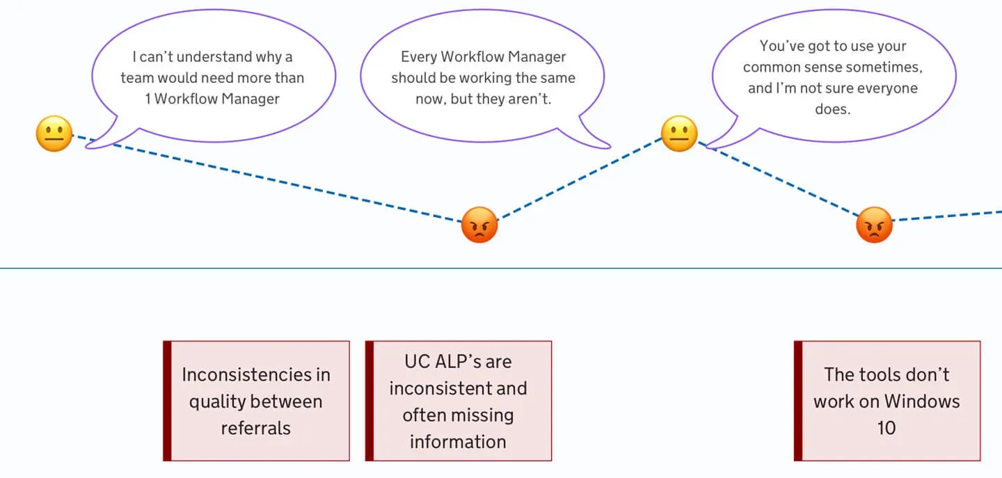
When doing user research, you often gain a lot of insights in the form of observations, interesting quotes and feedback.
The issue we were having was trying to relay all of that stuff back to the team in a meaningful way, rather than a mass of sticky notes on a whiteboard.
Task
My task was to create an easy to follow map, which showed the linear flow through a user journey and any insights at each step.
It needed to be anonymous, but not feel disconnected. It needed to still invoke empathy in the people reading it.
Action
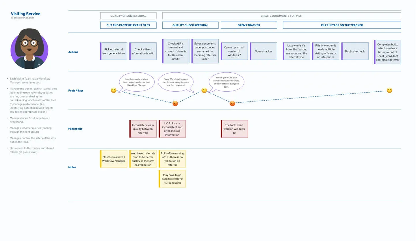
Personas
I created overview personas for each job role. These weren't personal, but included examples of what they do on a day to day bases, how many of these roles are in a team etc.
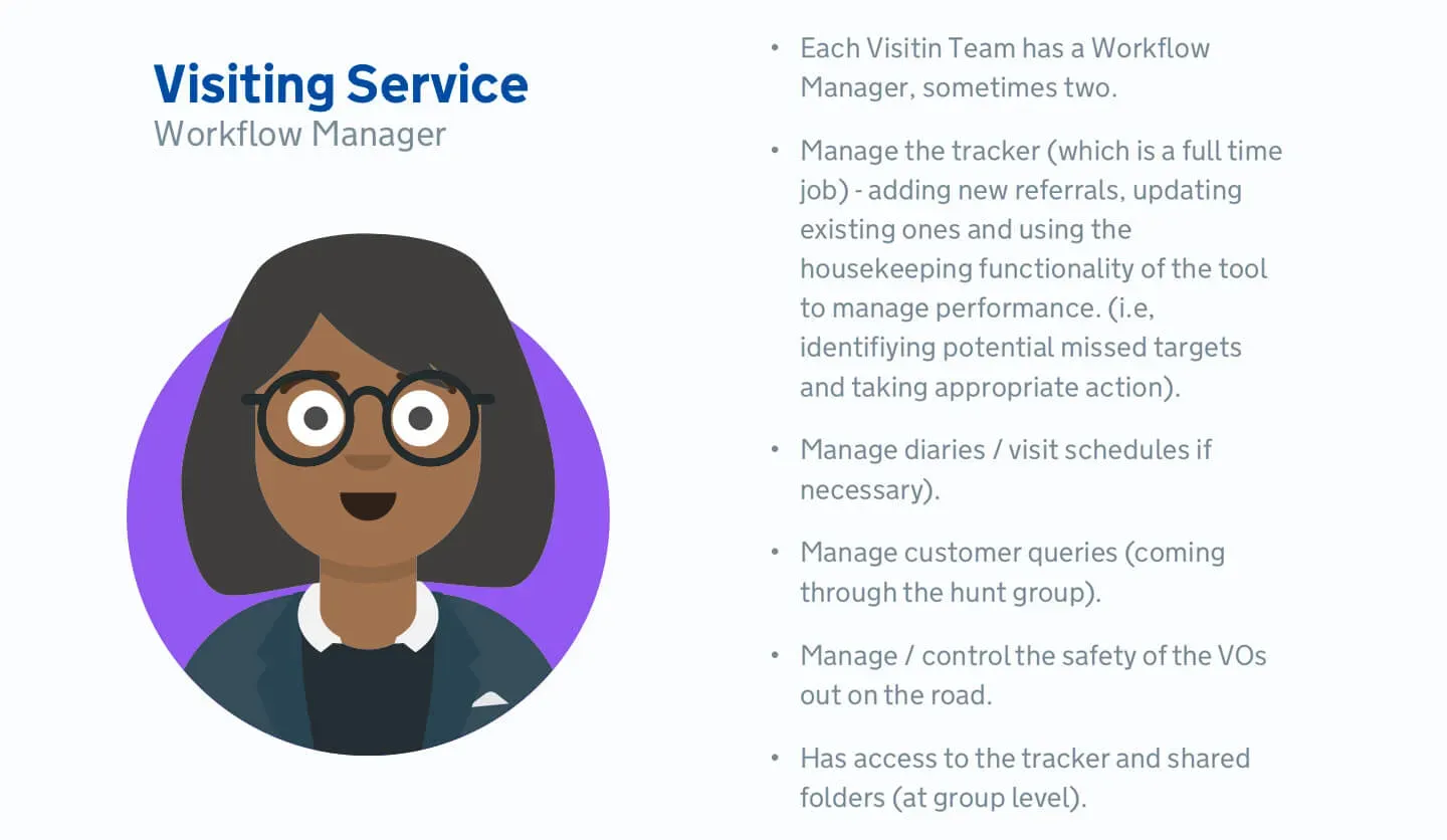
Example: A Workflow Manager
Each team has 1 or 2 Workflow Managers. They have access to the tracker and shared folders at a group level. They are responsible for:
- the tracker, adding new referrals, updating existing ones and monitoring performance
- diaries and visiting schedules if necessary
- customer queries
- the safety of Visiting Officers on the road
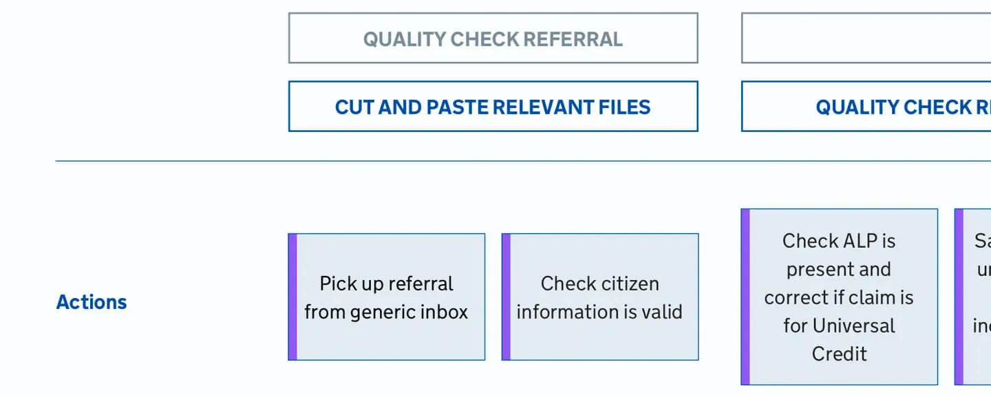
Rows
Each row represents a particular insight tied to the user and their journey. For example, what they were doing, how they were feeling and what they said at the time.
You can also collect any notes which don't fit into a particular category.
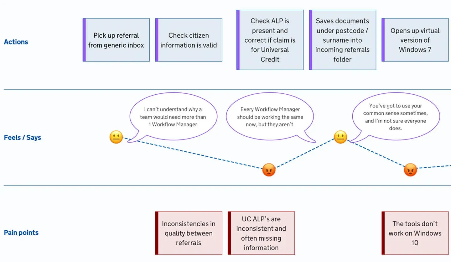
Columns
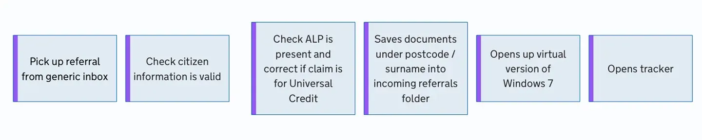
Each column represents a step in the process. It could be an interaction with a person or a step in a manual process. It represents a step of the journey the user must complete.
For example:
- Picks up referral from generic inbox
- Checks citizen information is valid
- Checks if additional info is correct part of a claim for Universal Credit
- Saves under postcode and surname, in the incoming referrals folder
- Opens up virtual version of Windows 7
- Opens the tracker document
Tasks or themes
If a task has more than one step or action, then you can group them to help people understand what it is the user was doing at the time.
Feelings and Quotes
Feelings and quotes are tracked at each step of the journey, and any particularly strong feelings can be attached to pain points or notes.
Positioning them high, medium and low in the row can help to illustrate whether a feeling was positive or negative.
Result
As a result of using these maps, teams and stakeholders can digest the insights from User Research easier. You can also condense a lot of insights into a single artifact which can be shared.
We also found that because they look interesting, when we hung them on the walls, people would stop and look at them as they passed our team space. This kickstarted many interesting conversations and got other people interested in the work. And you can never have enough allies in User Centred Design!